Tide gets a new look

Out with the old, a new Tide is in!
We’ve just pushed a fresh update to the iOS app and Android app. The new look is so much more than a cosmetic revamp. We’ve made many improvements to help speed up your experience and reduce loading times.
Even more exciting is that the new design lays the foundations for additional features that we’re planning to release in the coming months. These include multi-currency accounts and multi-user access, which would have been tougher to support using our previous layout. I’ve explained a little more about why we’ve made certain changes below – do sign in and take a look for yourselves! I hope you like it.
Caitlin Rich, Head of Design

A brighter design
We’ve focused on bringing a light, fresh and clear interface to life to help ease navigation throughout the app.

An expanded bottom navigation bar
We’ve increased this to 5 tabs (from the previous 3) to make it easier for you to make payments and issue invoices. We’ve also combined the profile and settings menu (previously on the account page) into a “More” tab so that they are easily accessible from wherever you are in the app.

Punchier timeline and categories
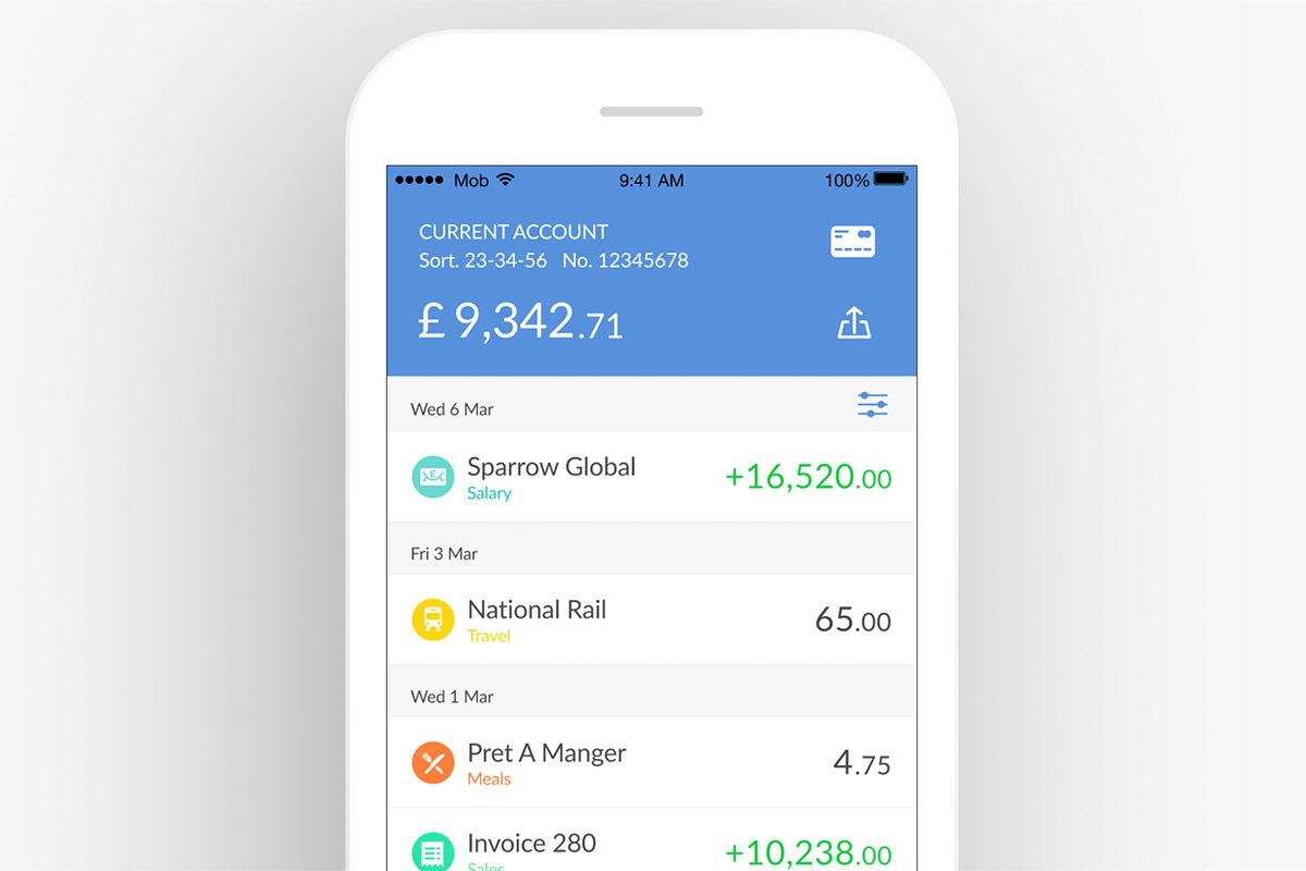
A clearer transaction timeline highlights your balance and makes your card details easier to access.
We’ve also brightened up the categories and added icons so that you can see where you are spending and find uncategorised transactions. Tapping these icons opens a new category picker.

Cleaner accounts screen
We’ve got less clutter here, with clearer balances and better access to your card details.

Easier access to Tide on the web
There’s now a larger camera area for scanning the QR code when logging in to Tide on the web (the website has had some major enhancements too).
This is more the start than the end – look out for more design developments! In the meantime, let us know what you think by dropping us an email on [email protected] or commenting your thoughts on the Tide Community.
Enjoy!


